The Dashboard Widget version opens first. This view gives you a customizable overview of the state of your cluster as a whole.

The Widget version is divided into two main sections:
Notice the color of the dot appearing next to each service name in the list of Services . The dot color and blinking action indicates operating status of each service. For example, in the Dashboard Widget image, notice green dot next to each service name. The following colors and actions indicate service status:
Table 2.1. Service Status
| Color | Name | Status |
|---|---|---|
 | Solid Green | All masters are running |
 | Blinking Green | Starting up |
 | Solid Red | At least one master is down |
 | Blinking Red | Stopping |
Click the service name to open the Services screen, where you can see more detailed information on each service.
On the main section of the screen, a customizable set of widget tiles presents information on the status of your cluster. There are simple pie and bar charts, more complex usage and load charts, and sets of links to additional data sources, as well as status information like uptime and average RPC queue wait times.
Table 2.2. Widget Interactions
| To: | Do: |
|---|---|
| Move widgets around on the screen | Drag and drop to desired position |
| See more detailed information | Hover over the widget box |
Table 2.3. Widget Interactions 2
| To: | Do: |
|---|---|
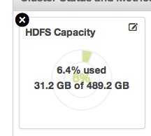
| Delete a widget | Click the X, marked in red |
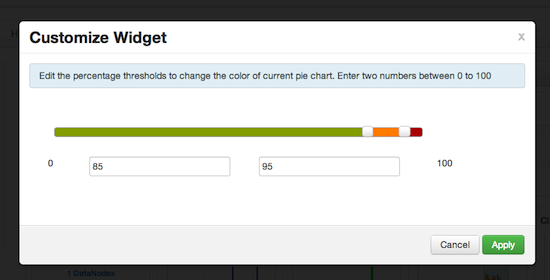
| Edit a widget | Click the small edit icon, marked in blue. The Customize Widget popup appears. |
Follow the instructions in the popup to customize the widget display. In this case, you can adjust the thresholds at which the HDFS Capacity bar chart changes color, from green to orange to red. Click Apply to save your changes. Not all widgets have an edit icon.
Table 2.4. Widget Interactions 3
| To: | Do: |
|---|---|
| Add back a deleted widget | Click +Add, outlined in green, and use the checkbox to select the widget you want from the dropdown menu |
| Use quick links to other information, like thread stacks, logs and native component GUIs | Click More, outlined in purple, and select from the dropdown menu |
| Zoom into more complex charts, like the Network Usage chart, outlined in orange | Click the chart. A larger version pops up. You can choose to add and remove information from the chart by selecting or deselecting the metric in the legend |
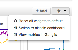
| Switch to the Classic version, return widgets to default setting, or view metrics in the native Ganglia Server interface | Use the gear icon |


